
Today, more data is being generated and collected than ever before. In fact, according to the World Economic Forum, it’s estimated that approximately 463 exabytes of data will be created each day. With so much data floating around, data visualization techniques are often needed to make sense of it all.
Enter illustrative designers who specialize in storytelling with data. Often, these professionals use infographics to present complex data in ways that are easier for audiences to understand.
If you’re interested in working in illustrative design, knowing how to create infographics using industry-standard data visualization techniques is a must. This includes not only deciding how to best present the data itself, but selecting the right color schemes, fonts, and more.
The Role of Infographics in Communication
What is an infographic, anyway? Specifically, an infographic refers to a multimedia graphic used to present data and information. Infographics may include graphs, charts, quotes, and illustrations.
Why Infographics Work
There are many reasons as to why infographics “work,” at least when they’re designed and used properly. Most notably, visualizations tend to be easier to understand than numbers. Charts, graphics, and illustrations are far more memorable to audiences than numbers alone. Similarly, when infographics are designed with the end user in mind, they also tend to be highly engaging and shareable.
Common Uses of Infographics
Infographics can be used in virtually endless ways, but the common trend is that they are used to display information in a way that is easy for the audience to understand and engage with. Some common ways in which infographics are used today include:
- In marketing materials as a means of building brand awareness and increasing engagement.
- In education, such as in textbooks to help students understand concepts and ideas.
- In business presentations, especially when sharing complex financial data and figures.
Best Practices for Designing Effective Infographics
When it comes to designing effective infographics, there are some data visualization best practices to keep in mind that may help you reach your audience and present information as clearly as possible.
Know Your Audience
First, it all starts with knowing your target audience, which means taking the time to conduct audience research. Knowing the demographics of your audience, as well as their pain points and interests when processing data, can help you choose the right data presentation techniques.
Keep the Focus Clear
When you’re working with massive amounts of information, it can be easy to deviate from your main points. Ultimately, one of the best pieces of advice you can keep in mind when designing infographics is to keep your focus clear. Take breaks throughout your design process to consider whether you’ve deviated from your main point by including too much extraneous information. If so, then it may be time to scale things back.
Visualizing Data for Maximum Impact
To maximize the impact, engagement and retention of your data, there are some specific infographic data visualization strategies you may want to implement. This includes selecting the right data from the beginning and deciding on the most effective visual format in which to present it.
Choosing the Right Data
When deciding on which data is the most relevant to share, it’s generally best to follow a minimalist approach. This means starting with only the data that is absolutely essential to make your point, and then adding complementary layers as you see fit. Otherwise, an infographic overloaded with data can quickly lose its effectiveness and is unlikely to hold its audience’s attention for long.
Selecting the Appropriate Visual Format
There are so many options to choose from when it comes to infographic formats. From pie charts and graphs to illustrations and other graphics, it will be up to you as the designer to choose the right visual format for your infographic. Ultimately, the ideal format will depend on the type and amount of data you’re trying to communicate, as well as the preferences of your target audience.
Design Principles for Compelling Infographics
When brainstorming infographic layout ideas and implementing data visualization techniques, you’ll also want to fall back on some essential design principles as they relate to color, contrast, white space, and typography.
Color and Contrast
Selecting the right infographic color schemes can make all the difference when it comes to capturing your audience’s attention and keeping them engaged. Many designers find that incorporating contrast into visual designs is a great way to make certain elements stand out while making infographics more memorable as well.
Typography and Readability
Don’t underestimate the power of typography in designing a successful infographic, either. Generally, the best fonts for infographics are simplistic and easy to read for all audiences. Examples include serif and sans serif fonts without much in the way of flourish or embellishment. Likewise, designers should avoid using too many different typefaces in their infographics, as this can make the design look too busy and may be a deterrent for audiences.
White Space and Layout
When designing an infographic, it’s also crucial to incorporate white space into your design as a means of drawing the audience’s attention to key points. This technique can be used in the creation of your infographic’s overall layout, which should present information in a hierarchical and easy-to-follow manner.
Tools and Software for Creating Infographics
Illustrators and designers have plenty of tools at their disposal when it comes to creating eye-catching and effective infographics, including dedicated infographic design software and templates to help them get started. Designers may also have access to data visualization tools, which can help them better understand and present data in the most effective ways.
Popular Infographic Tools
Some of the most popular infographic tools used by professional designers today include:
- Piktochart– An infographic design platform with more than 11 million users.
- Canva – A visual software suite that includes infographic design tools and pre-loaded templates.
- Venngage – A professional infographic software platform with more than 10,000 templates to choose from.
- Infogram– An infographic and data visualization tool that makes it easy to create interactive and engaging graphics from scratch.
Tips for Using Templates
Infographic templates can be a great way to save time in your design, but there are some tips to keep in mind if you plan on using them. Most importantly, choose a template that will work for your specific data visualization needs. This means knowing what your end-goal for the infographic is before you select a template, rather than choosing a template and trying to make your data fit into it.
Whenever possible, find ways to customize your template by changing fonts, color schemes and other details as well.
Optimizing Infographics for Online Sharing
One of the most important aspects of a successful infographic is shareability. Ideally, you’ll want to design infographics that capture your audience’s attention and are readily shared around social media and other platforms — but how?
Ensuring Mobile Compatibility
First and foremost, make sure that your infographic is designed and formatted in such a way that it can be viewed on any device. The best way to do this is typically to save your infographic as a universal image file. This way, you won’t have to worry about text boxes becoming shifted out of place or fonts not translating to another device.
Sharing and Promotion
Encourage sharing of your infographic by sharing it to your brand’s own social media pages. You can also submit your infographics directly to design directories, which could help increase exposure and increase the chances of further sharing. As part of a marketing strategy, many brands will also publish infographics as a part of larger blog posts or even in an email marketing campaign.
Case Studies of Effective Infographics
It’s one thing to read about infographic design tips, but what can really be helpful to provide you with some infographic design inspiration is to take a look at some case studies of effective infographics for yourself.
Example 1: Infographics for Corporate Reports
The below Twitter (now X) infographic report provides in-depth detail about the brand’s popularity, number of users, and much more in an accessible way.

Example 2: Infographics in Digital Marketing
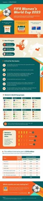
The following infographic was published in 2023 to spread awareness of the FIFA Women’s World Cup, offering details about the event’s history, unique features of the event and information on where to watch it.
Example 3: Infographics in Health Education
The below infographic on antibiotic resistance as a global threat draws audiences in with its eye-catching design, then goes on to provide critical data on the causes of antibiotic resistance and what can be done to stop it.

Sharpen Your Illustrative Design Skills at RMCAD
When infographics are thoughtfully and skillfully designed, audiences can better interpret complex data and its relationship to other information. Of course, learning how to create infographics isn’t something that happens overnight. Instead, it is a skill that takes a great deal of practice and an understanding of infographic visualization techniques.
If a career in illustrative design sounds appealing to you, then Rocky Mountain College of Art and Design’s Bachelor of Fine Arts in Illustrative Design may be an excellent starting point. In this degree program, you can learn the technology, skills and tools needed to effectively use digital art design software technology while solving complex design problems. Plus, this program is also offered in an online format to suit your scheduling needs.
Get in touch to learn more about this degree program, or get the ball rolling by completing your online application for admission today.