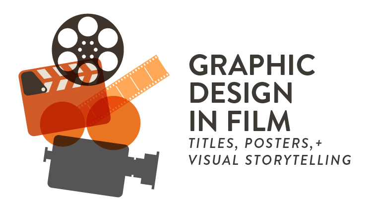
Graphic design is a thriving career path with many exciting opportunities for designers in the film industry. You see their hard work every single day. Production companies hire designers to create promotional graphics for film and often need multiple versions of each product for marketing. While the fundamentals are the same regardless of the project, graphic designers must also bring a level of detail and care to every title sequence, poster design, and piece of visual media that imbues it with the unique qualities of the film. In this blog you will learn about how graphic designers can be applied to the exciting world of film!
The Role of Graphic Design in Visual Storytelling
You have likely heard the old adage “show don’t tell” a thousand times. While this saying isn’t unique to the medium of film, it is particularly pertinent. For graphic designers, who are responsible for visually communicating details about a film to an audience’s conscience, it is an especially important rule to follow. Designers must set a tone and communicate what kind of story viewers can expect to see.
Setting the Tone Through Visual Elements
There are multiple ways to convey the tone of a movie through movie poster design such as; the title, the tagline, any visible stars, or the imagery itself. If the poster is for an action movie then the tagline could be “the most dangerous thrill ride of the summer.” However, taglines are often only read if a poster has already caught someone’s eye. Consider that phrase “show don’t tell” again. A tagline might “tell” the audience that the movie is a thrill ride but a designer could put an image of a man driving a motorcycle past an explosion and “show” them how thrilling the movie is. By visually setting a tone designers can pull audience members in deeper to convince them to buy a ticket.
Communicating Narrative Through Graphics
Once a tone has been set the next most important thing to do is to show what the story is about. Just because an audience member tends to enjoy action movies does not mean that they will buy a ticket. Narrative, however, can be much more difficult to convey in a poster because it requires the viewer to infer some amount of context. This is where posing actors and creating compelling taglines can inform the audience of the hook of the story. It’s important to note that designers must craft materials that get the audience engaged but don’t show them too much of what’s to come.
Poster Design as a Marketing Tool
Posters are often an audience member’s first impression of an upcoming film, and title sequences are much the same as they serve as the first few minutes in most movies. As such, it is important that movie marketing visuals captivate the audience’s attention and imagination. It’s not enough for posters to read as a standard ad they must be compelling.
Balancing Art and Advertising
On one hand a movie poster only exists to promote the movie itself. Therefore the advertising details need to be clear, concise, and make the film appear interesting. On the other hand, some of the most creative movie posters are remembered as stand alone works of art that take bold risks. Many movies aim to invoke the nostalgia of some of these iconic film posters to visually communicate to the audience that it is similar to another familiar movie. While this can help in the advertising it may also be considered generic by some film-goers.
Genre-Specific Poster Styles
Most movie poster designs express the genre of a film just through visual cues in graphic design. As previously mentioned, there are many visual markers that can be utilized to communicate genres such as explosions for action or a drippy red font for horror. Diving deeper though there are even well-established norms for utilizing color to establish tone and genre. For example, independent dramedy (drama-comedy) films have a storied history of using yellow to catch the eye and easily communicate a playful nature through off-beat choices.
Designing Title Sequences That Captivate
Title sequences often happen at the beginning of a movie but can also be at the end, or even both. On blockbuster movies and indie productions alike it takes a team of hundreds, and in many cases thousands, of people to bring a film to life. As such, title sequences are just one way to not only thematically highlight the title of a movie but also pay the well deserved recognition to the people and production companies who created it. That may sound drab, but many films have managed to elevate this scrolling of a long list and make it engaging and cinematic.
Historical Evolution of Title Design
Title sequence design has evolved a lot over the last hundred or so years of cinema. They began as simple title cards that communicated the bare minimum, not unlike a slide show. As years went on however title sequences have evolved into their own artform that is able to succinctly communicate their own narrative beats. Think of the end credits for a movie like Wall-E which uses various art styles alongside the credits of the movie to serve as an epilogue to the film.
Famous Examples in Film
Some of the most iconic and legendary title sequences of all time come from the long-running, James Bond film series. Over more than half-a-century, dozens of artists have worked to create exciting visuals that represent the dangerous and exciting world of international spy James Bond. Paired with the classic gun-barrel intro and new song by a popular musical artist, these sequences not only make the title sequence a cinematic experience in its own right, but also help reinforce themes and motifs unique to each individual Bond film.
Visual Branding for Film
Film branding design is important for creating a connection in an audience member’s head between other films. In film, this often looks like utilizing a standardized font, color scheme, and naming conventions so that audience members can discern that a new movie may be part of a franchise or is at least in some way similar to existing films. By curating these particular decisions, production companies can show the audience a cohesive brand for a film with little more than a poster of a title sequence.
Typography and Color Palettes
Two of the most important tools for any graphic designer to consider are typography and color palette. No place is this more relevant than in poster and title sequence design, as these branding choices are relevant on every single project. These elements can efficiently communicate so much about a movie through the simplest means necessary. Comedy’s often use big bold titles in red to establish a carefree tone where Science fiction utilizes san-serifs and ambient glow to spark whimsy through minimalism. All these poster typography decisions are made to reinforce the imagery used in the poster and the tone of the film itself.
Cohesive Campaigns
In a cinematic landscape that is dominated by sequels, prequels, reboots, reimaginings, and character spin-offs, production companies are always attempting to capitalize on the goodwill that audiences have for previous films. However, this goodwill is useless if audience members are unable to recognize a movie as part of a franchise. This is why marketing campaigns utilize cinematic graphic design elements to signal to consumers that a movie exists in a shared universe. Take the Fantastic Beasts franchise which is a spin-off of the Harry Potter movies but has a brand new cast and setting. By utilizing a similar typography style for the title the designer is able to harken back to the Harry Potter movies while establishing a new tone for the series.
Behind the Scenes: The Design Process
Graphic designers do a lot of visual storytelling beyond just marketing materials. Many films employ graphic designers in the production design department to help build specific elements for the movie. This can range from billboards to t-shirts depending on the scope of the project. A graphic designer working on a film may find themselves working on a truly wide array of projects.
Collaboration Between Designers and Directors
In many films the graphic design can feel like it’s the main character. Take the example of They Live, a 1988 horror/Sci-Fi film that utilized hyper-minimalistic graphic design to satirize 1980s consumer culture with billboards that read “Buy”, “Obey”, “Consume”, “Conform”, and “Submit.” The designs in the film became so iconic in their own right that they later inspired the street wear brand OBEY with the simple yet ominous graphics.
The potential to build a future as a graphic designer is seemingly endless in the world of cinema. Designers are constantly being employed on projects big and small throughout the production process. Whether you are already a graphic designer or are just thinking about getting started, these are just a handful of the tools and techniques you will want to consider if you are looking to begin a career in graphic design for movies. There are a wide variety of opportunities for artists who can harness the power of storytelling to create visually striking and memorable designs.
Telling Your Story Through Design
Looking to break into the film and industry as a graphic designer? Check out Rocky Mountain College of Art + Design, we offer on-campus and online BFAs in Graphic Design. Both programs provide you with an opportunity to learn about typography, color, visual storytelling and other visual branding elements required to succeed as a graphic designer in the film industry. Request more information about our graphic design degree programs today.