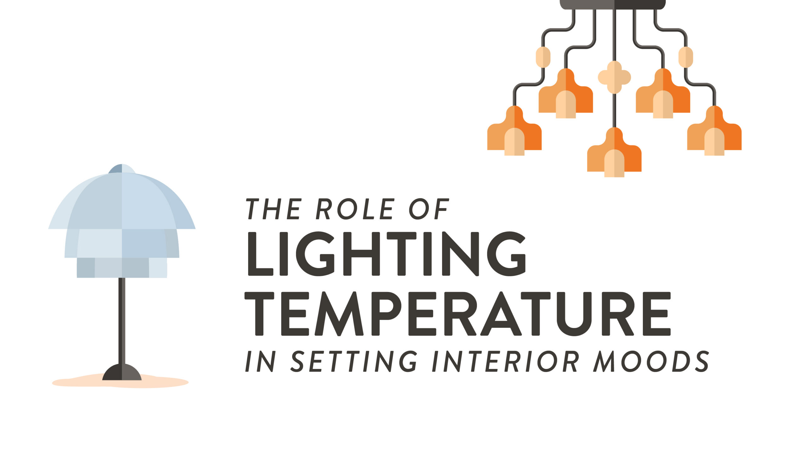
Lighting is one of the most powerful – and often underestimated – tools in interior design. Beyond simply making a space visible, lighting shapes emotional response, supports biological rhythms, affects perception of materials and color, and defines how people function within a space. Understanding how to work with lighting temperature allows designers to craft environments that feel calm, energized, intimate, or expansive – all before a single piece of furniture is chosen.
Foundations of Color Temperature
Before lighting can be used to shape mood, behavior, or atmosphere, it’s essential to understand what “color temperature” actually means and how it influences our perception of space. From the warm glow of evening light to the crisp clarity of midday sun, different lighting temperatures communicate subtle psychological and emotional cues.
What Kelvin Measures and Why It Matters
Color temperature is measured in degrees Kelvin (K), a scale that describes the visual warmth or coolness of a light source. Although the unit originates from physics and thermodynamics, in lighting design it serves as a practical language for predicting how light will feel in a space. Lower Kelvin values correspond to warmer, amber-toned light, while higher values produce cooler, bluer light that more closely resembles daylight.
Kelvin selection influences far more than mood. It affects color perception, material appearance, visual comfort, and even how a large or small space feels. Warm light tends to soften contrasts and compress space, creating a sense of enclosure. Cool light increases perceived clarity and spatial openness. Because of this, choosing the appropriate Kelvin value becomes a foundational design decision rather than a finishing touch.
Warm, Neutral, and Cool: Perception and Emotion
Warm light, typically ranging from 2200K to 3000K, carries amber and golden tones reminiscent of firelight and sunset. These natural associations trigger feelings of comfort, safety, and intimacy. Spaces illuminated with warm light often feel smaller, softer, and more enclosed. This makes warm lighting ideal for living rooms, bedrooms, restaurants, lounges, and hospitality lighting where relaxation and emotional connection are priorities.
Neutral light, generally between 3500K and 4100K, creates balance. It avoids the heavy warmth of incandescent tones and the stark sharpness of cool daylight, resulting in illumination that feels natural and adaptable. Neutral light supports both comfort and functionality, making it well suited for offices, classroom lighting, retail spaces, and multi-purpose environments.
Cool light, from approximately 5000K to 6500K and above, introduces bluish tones associated with open sky and midday sun. This spectrum stimulates alertness, sharpens focus, and enhances visual acuity. Spaces lit with cool light often feel larger, cleaner, and more energetic. These qualities make cool lighting effective in healthcare settings, laboratories, manufacturing facilities, and task-heavy work environments where accuracy and attentiveness are essential. However, prolonged exposure to overly cool lighting can feel clinical or fatiguing, particularly in spaces meant for rest or social interaction.
By deliberately choosing between warm, neutral, and cool lighting – and even blending them within layered systems – designers shape not only how spaces look, but how they are emotionally experienced.
Human Factors and Circadian Effects
Lighting does more than shape how a space looks – it directly influences how people feel, think, and function. Utilizing the powerful connection between light, the human body, and biological rhythms, reveals how thoughtful lighting design can support wellbeing, productivity, and long-term health.
Alertness, Relaxation, and Biological Timing
Light is one of the strongest regulators of the human biological clock. Beyond enabling vision, it sends continuous signals to the brain that influence sleep cycles, hormone production, mood, and cognitive performance. This internal circadian rhythm responds primarily to the color, intensity, and timing of light exposure.
Cool, blue-rich light stimulates photoreceptors in the eye that suppress the production of melatonin, the hormone responsible for signaling sleep. Therefore, cooler light is especially effective in the morning and midday, when the body naturally seeks stimulation and engagement. As the day progresses, our biological needs shift. Exposure to warmer light in the evening allows melatonin levels to rise, preparing the body for rest and recovery. This makes it ideal for residential environments, hospitality spaces, and any setting designed for unwinding or social connection later in the day.
When lighting systems ignore this natural cycle and provide static, overly cool illumination throughout the day and evening, the result can be circadian disruption. This disruption is linked to fatigue, sleep disorders, reduced cognitive performance, and long-term health risks. By aligning lighting design with the body’s internal clock, designers move beyond aesthetics and functionality, creating spaces that actively support human health and performance.
Age, Vision, and Cultural Preferences
Human response to lighting temperature is not universal. Age, visual ability, and cultural background all play significant roles in how light is perceived and experienced. Effective lighting design must account for these differences to create spaces that are both inclusive and comfortable for a wide range of users.
As people age, their eyes undergo physical changes that affect how light is processed. Thus, older adults often require higher overall light levels and may prefer warmer color temperatures that feel softer and less glaring. Cool, high-intensity lighting can feel harsh or uncomfortable to aging eyes, increasing visual fatigue and reducing spatial comfort.
Individuals with visual impairments or heightened light sensitivity may struggle in environments with excessive brightness, extreme color temperatures, or poorly controlled glare. Balanced, layered lighting with careful shielding become essential for maintaining accessibility and comfort.
Recognizing these human variables allows designers to avoid one-size-fits-all solutions. Instead, lighting becomes a responsive design element that adapts to the needs, expectations, and comfort of the people who inhabit the space.
Layered Lighting Strategy
Great lighting design is built through layers, not single fixtures. By combining multiple types of light with intentional placement and color temperature selection, designers create spaces that are flexible, comfortable, and emotionally rich.
Ambient, Task, and Accent: Roles and Ratios
At the core of every successful lighting plan is a thoughtful balance of three essential layers: ambient, task, and accent lighting. Each plays a distinct role, and together they create spaces that are both functional and emotionally engaging.
Ambient lighting provides a strong foundation. It delivers general illumination that allows people to navigate a space safely and comfortably. This layer establishes the overall mood of the room and typically uses broader, softer distribution to avoid harsh shadows.
Task lighting is designed for specific activities that require greater visual precision, such as reading, cooking, writing, or detailed work. Desk lamps, under-cabinet lights, pendant fixtures over work surfaces, and vanity lights all fall into this category. Task lighting generally uses higher illumination levels and, in many environments, slightly cooler or more neutral color temperatures to support focus and visual clarity without causing strain.
Accent lighting adds drama and depth by highlighting architectural features, artwork, textures, and focal points. Track lights, spotlights, wall grazers, and integrated display lighting help define spatial hierarchy and visual interest. Accent lighting often employs warmer color temperatures to create contrast with ambient light and draw the eye toward specific elements.
When these layers are carefully coordinated – especially in their brightness levels and color temperatures – lighting becomes more than illumination. It becomes an active design tool that shapes how people move, work, relax, and connect within the environment.
Glare Control, UGR Targets, and Shielding
Even the most beautifully layered and carefully colored lighting can become uncomfortable if glare is not properly managed. Glare occurs when light sources are too bright or poorly positioned, causing visual discomfort, fatigue, or even reduced productivity. Controlling glare is essential for both functional performance and the overall emotional experience of a space.
The Unified Glare Rating (UGR) is a widely used metric that measures visual discomfort caused by direct or reflected light. UGR values are calculated based on luminance, viewing angles, and room geometry. For most interior environments, recommended targets include:
For rooms such as offices, classrooms, and workspaces where prolonged focus is required UGR < 19 is typically used. For circulation areas such as public spaces and residential lighting UGR < 22 is recommended. Maintaining UGR targets ensures that lighting is bright enough for the room’s function without creating harsh or fatiguing conditions.
Shielding is one of the primary strategies for glare control. Fixtures with louvers, diffusers, or indirect lighting components redirect light away from the eye, softening brightness while maintaining adequate illumination. Positioning fixtures carefully relative to sight lines and work surfaces further minimizes direct glare.
By combining proper shielding, fixture selection, and UGR-aware placement, designers can balance brightness, color temperature, and emotional impact without sacrificing comfort. Controlled lighting allows warm tones to feel cozy rather than overpowering and cool tones to feel crisp rather than harsh, creating a space that is visually pleasing, functional, and sustainable over time.
Lighting with Intention
Lighting temperature is far more than a technical specification—it is a vital design tool that shapes mood, perception, and human wellbeing. From the foundational science of Kelvin and color metrics to layered strategies, every choice influences how a space is experienced. By understanding and thoughtfully applying warm, neutral, and cool light, designers can create interiors that are functional, emotionally resonant, and visually compelling. Ultimately, mastery of lighting temperature transforms spaces from merely illuminated to deeply lived-in and thoughtfully human.
Explore the Power of Lighting at Rocky Mountain College of Art + Design
Lighting sets the stage for the intention and use of each particular room – requiring interior designers to be particularly deliberate with their design choices and ideas. At Rocky Mountain College of Art + Design, we offer an on-campus Bachelor of Fine Arts in Interior Design as well as an online Bachelor of Fine Arts in Interior Design that allow students to establish a strong foundation in design theory as they build the practical, technical and creative skills required to succeed in the field of interior design. Request more information about our fine arts degree programs today.
FAQs: Lighting Temperature in Setting Interior Moods
Q1: What is the Kelvin scale, and how do I choose a temperature?
- Kelvin (K) describes the warmth/coolness of light: ~2700–3000K: warm; 3500–4000K: neutral; 5000–6500K: cool. Match CCT to task, time of day, and materials.
Q2: Is CRI more important than color temperature?
- Both matter. CCT sets mood; CRI/TM-30 describes color fidelity and saturation. Aim for CRI 90+ (or TM-30 Rf ≥ 90) where accurate color is critical.
Q3: When should I use tunable white lighting?
- Use in multi-use spaces, classrooms, healthcare, and offices to shift from cool (focus) to warm (relax). Program scenes to avoid constant manual changes.
Q4: Can I mix warm and cool lights in one room?
- Yes—if intentional. Keep each layer consistent (e.g., warm ambient, neutral task) and avoid clashing on the same surface. Test with mockups before install.
Q5: Why do finishes look different at night?
- LEDs have distinct spectra; some pigments shift (metamerism). Review samples under the actual fixtures and CCT you’ll install.
Q6: How do I reduce glare with brighter, cooler lights?
- Use shielding, diffusers, correct beam spreads, and lower luminance at high viewing angles. Target comfortable UGR values and add task lights where needed.
Q7: What CCT is best for video calls and hybrid offices?
- Neutral (3500–4000K) with high CRI/TM-30, soft frontal fill, and controlled backlight. Avoid strong mixed CCTs in the camera frame.