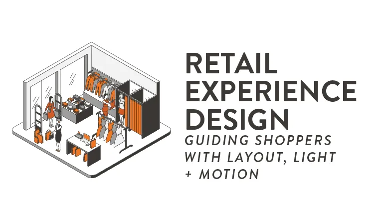
Key Takeaways:
- Thoughtful interior design tactics in retail spaces can increase customer dwell time and can even convert into greater sales.
- Readers will learn how to use lighting, visual hierarchies, and motion to create a display that enhances dwell time and conversion.
- Designers who comprehend these principles are well-equipped to assist clients in refreshing existing stores and opening new ones.
- Learn how you can design outstanding layouts for retail by downloading planogram software that helps visualize efficient spaces.
Retail spaces are meticulously designed to make shopping feel intuitive and engaging for customers. By utilizing interior design principles, stores can not only help shoppers find products easily but also fill them with comfort! With fantastic opportunities for interior designers in retail, careers can range from working in malls and stores all the way to roles at Disney World!
Why Retail Experience Design Shapes Shopper Behavior
While it’s easy to think that great products and great prices are the only things that affect consumer choices, that is far from the truth. The same interior design concepts you might expect to see in a home, such as lighting design and layout, can encourage positive shopper behavior, including spending more time in a storefront and making larger purchases.
How Layout, Light, and Motion Influence Dwell Time and Conversion
According to Retail Sense, dwell time is “the length of time a person spends looking at a display.” Dwell time is directly related to the store’s conversion rate (the ratio of potential customers to actual customers) and can be significantly increased with a few small improvements.
What Makes a Store Feel Intuitive Instead of Overwhelming?
If arranged improperly, shops, big or small, can overwhelm shoppers, thus prompting them to leave prematurely. Physical cues such as tight walkways, cluttered shelves, and poor organization can make customers feel uncomfortable–prompting them to leave.
Start With the Shopper Journey
To best improve the in-store customer experience, it is important that interior designers put themselves in the customer’s shoes. Thinking about how the shopper journey begins at the outside entrance, then winds its way throughout the store, designers can aim to influence a predetermined path to improve dwell time.
Entry Zones and First Impressions
Entry zones are a key consideration in retail design as the shopper journey begins before customers even enter the store. This is particularly true in spaces like malls where foot traffic is high, and customers may enter a store on a whim because of eye-catching displays.
Mapping Circulation Paths From Discovery to Checkout
While most retailers utilize floor plans that promote extensive exploration, with easy access from section to section. Other retailers, such as Ikea, utilize a more rigid circulation path that guides customers through a pre-determined linear path. Both approaches can be successful depending on the retailer’s needs and customer expectations.
Build a Strong Layout and Planogram Strategy
Many designers may begin crafting their layout with a planogram strategy, a detailed schematic of the storefront from a bird’s-eye view. Indeed says a planogram “displays what sections the store may include and where they might go, and it explains the specific locations for each product by aisle, display, or point of sale.” With existing planogram software, designers can quickly mock up a rendering for their store.
Organizing Product Zones for Clarity, Adjacency, and Cross-Selling
A strong store layout can increase the value a customer spends within a store. Utilizing adjacent product zones promotes more impulsive purchase decisions. For example, if a shopper enters a sporting goods store with the intent to purchase new sneakers, they may also leave with an additional sweatshirt, provided that the sweatshirts are near the sneakers, clearly labeled, and have a strong display to promote the sweatshirts.
Using Planograms to Balance Visual Consistency and Flexibility
Retail spaces are living, breathing interiors that must be easily adjustable with seasonality and inventory changes in mind. As such, a strong planogram will design different product zones with the express intent of being malleable. However, a balance between consistency and flexibility must be struck to provide a greater ease of access for repeat customers who may remember a previous season’s store layout.
Create Focal Hierarchies That Guide Attention
Strong interior design is like a well-made movie. Meticulously directing the eye with care and purpose. Customer attention is primarily directed through the clever use of focal hierarchies that have consumers shift their gaze from larger waypoints to smaller, more specific ones. In retail, when designers highlight products in this way, it is called visual merchandising.
Hero Displays, Sightlines, and Feature Tables
As previously mentioned, eye-catching displays can mean the difference between shoppers crossing the threshold or not. Therefore, window displays are just as important as end cap displays. Serving as waypoints for store organization, these hero displays, such as mannequins or large photographs, are a form of visual merchandising that communicates to a customer where items like jeans or sweaters may be found within a store. By minimizing tall shelves or other obscuring clutter, customer sightlines can be preserved to navigate from one display to another to find specific feature tables.
Layering Primary Zones and Impulse Zones
In a well-organized retail space, different spaces will serve different purposes. Primary zones are the key points of contact that designers curate to ensure customers come into contact with these large, oftentimes more expensive displays. On the other hand, impulse zones capitalize on offering a variety of more affordable products that customers may purchase on a whim. Impulse purchase placement is when these zones are placed near the door or the point of sale counter.
Use Lighting as a Navigation Tool
Next time you are in a retail setting, take a look up at the ceiling and try to count the number of lights you see. Indeed, most retailers make heavy use of track lighting to ensure displays, products, and signage are well-lit and easily locatable. Designers should consider how retail lighting not only lights products but also how it makes customers feel.
Ambient, Accent, and Task Lighting for Merchandise Readability
If things like price tags and product descriptions are not visibly lit and easily readable, then even the most carefully curated store layouts can fall short of engaging shoppers. As such, designers should consider retail lighting that not only makes product zones comfortable and on brand but is also highly functional for customers and employees alike.
Highlighting Key Products Without Creating Glare or Fatigue
Designers can literally “spot light” major products to maximize their impact on the customer and influence their purchasing decisions. However, too much light can make products straining to look at. Some key considerations should be made on how to direct attention without overpowering the senses while using lighting. Some retailers, like Abercrombie & Fitch in the 2000s, even design darker storefronts to establish a tone and help major products stand out.
Add Motion and Visual Rhythm With Purpose
One of the easiest ways to direct attention is with television screens, installation art pieces, and other dynamic visuals. However, if used improperly, they can overstimulate consumers and make a store feel busy and overwhelming. Used thoughtfully, though, they can inform customers on upcoming deals, seasonal offerings, and important dates.
Digital Screens, Kinetic Elements, and Seasonal Storytelling
Perhaps the simplest way to add motion to a storefront is to incorporate television screens that display eye-catching visuals to promote a store’s products. A little goes a long way. Imagery should remain primarily static with small flourishes of movement on key details, such as prices or sale dates, which is just enough to capture a shopper’s attention. Remember, these kinetic elements are designed to inform, not entertain.
Using Motion Sparingly to Direct Rather Than Distract
Designers should avoid creating a barrage of stimuli that distracts the consumer from a store’s products. Instead, motion can be used sparingly in window displays or on TVs to highlight particular goods or sales. Retailers and interior designers may consider collaborating with graphic designers to create imagery that drives the conversion rate.
Support Conversion Through Comfort and Readability
Interior designers can further aid in conversion by implementing small changes that go a long way. Prioritizing comfort will ultimately increase dwell time. Investments in furniture can go a long way in a retail setting, especially for individuals who aren’t likely to make a purchase themselves but are with someone who is. By providing a comfortable seating area, a shopper’s guest is less likely to rush them out of the store.
Fixture Heights, Aisle Widths, and Pause Points for Browsing
Accessible shelf and table heights, as well as aisle widths, are important considerations for people of all abilities. By not just abiding by ADA design codes but by thinking critically about the customer experience of all people, designers can improve the shopping experience of every customer. Spacious walkways are also important for creating pause points. Pause points are areas that engage customers to stop and look more closely instead of filing past.
Signage, Pricing, and Wayfinding That Reduce Decision Friction
Perhaps, the worst side-effect of bad design is when a customer comes to a store hoping to purchase a particular product, but they can not find it, and decide to leave without buying anything. Retail designers can minimize lost sales by using strong visual hierarchies and displays to direct customers to specific zones.
Measuring Success and Refining the Experience
The so-called “rules” of store layout optimization are always evolving with new technological advancements and changes in inventory. Therefore, it is important that retail designers continually measure the success of their layouts. By utilizing data, designers can further improve conversion.
Tracking Dwell Time, Traffic Flow, and Conversion
According to Retail Sensing, “a 1% increase in dwell time resulted in a 1.3% increase in sales.” Therefore, it is invaluable to track what makes people dwell longer. As such, designers should consider the customer experience of traffic flow to help move shoppers throughout the store. Customers stopping due to heavy congestion of foot traffic is not the same as stopping to browse products.
Using Observation, Heatmaps, and Seasonal Resets to Improve Results
Advanced cameras can create “Heatmaps” which visually track the frequency of pause points. The more people pause in a certain zone, the “hotter” that spot becomes on the heatmap. From there, similar display strategies can be replicated in “colder” zones to increase the dwell time with other products. Even in highly dwellable zones of a storefront, designers can utilize these tools to refresh or redesign a display for greater success.
Learn How to Design for Retail at Rocky Mountain College of Art + Design
If you love shopping and designing one-of-a-kind spaces, then retail design may be the industry for you! At Rocky Mountain College of Art + Design, we offer an on-campus Bachelor of Fine Arts in Interior Design degree as well as an online Bachelor of Fine Arts in Interior Design degree — both of which allow you to explore the role of seasonal color palettes, lighting, and circulation patterns in design-driven contexts. If you are looking to leverage strong design to create comfortable environments, then RMCAD is right for you.
To get started, request more information or apply to a fine arts degree program today.
FAQs: Retail Experience Design
Q1: What is the main goal of retail experience design?
- The goal is to make shopping feel intuitive and engaging so customers stay longer, find products more easily, and feel more confident making a purchase.
Q2: How do planograms improve store performance?
- Planograms create consistency in product placement, support visual hierarchy, and make it easier to test what drives sales across locations or departments.
Q3: Why is lighting so important in retail design?
- Lighting affects mood, product visibility, and attention. Good lighting helps shoppers notice focal products, read signage clearly, and feel comfortable in the space.
Q4: How can motion be used without becoming distracting?
- Motion works best when it highlights one priority area, reinforces a campaign, or supports navigation. Too many moving elements can compete for attention and reduce clarity.
Q5: What layout features increase dwell time?
- Clear circulation paths, pause points, strong focal displays, comfortable aisle widths, and layered merchandise zones all encourage shoppers to explore more of the store.
Q6: How do designers know if a retail layout is working?
- They look at shopper flow, dwell time, conversion rate, basket size, and observation data to see where people pause, skip, or disengage.
Q7: What is the biggest mistake in retail experience design?
- Trying to communicate everything at once. When every zone competes equally, store layouts, shoppers lose focus, and the store feels chaotic instead of inviting.