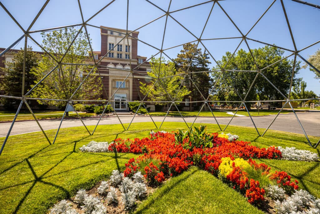
Geometric patterns in art have long been used to define the artistic space and create a framework for the piece. Besides being functional, shapes are also widely used as symbols in art. By exploring the psychological effects of shapes, students interested in illustrative design can begin to create more complex and impactful illustrations.
Understanding the Visual Language of Shapes
Shapes are defined as the outline of a form, but in art and illustration, shapes are more than simply geometric figures. They convey meaning and express emotion. They can be used as powerful symbolic representations. By understanding the visual language of shapes, you can work to incorporate them artfully in graphic and illustrative design.
The Basics of Shape Psychology
Within art and graphic design, shape psychology is the study of how shapes can be used to influence human emotion and perception within a piece. According to research published in Frontiers in Psychology, shapes can elicit emotions in humans, and the emotions that people experience through their perceptions of shape in art may vary from one person to the next. While the emotional responses to shapes may vary, it’s essential to understand the basics of shape psychology to incorporate shapes and geometric patterns artfully into your work.
Visual Rhythm and Balance
When incorporating shapes into your illustrations and designs, you will need to do so strategically to achieve a sense of visual rhythm and balance. Research Design Connections magazine maintains that actively working to achieve visual rhythm and balance allows you to create a sense of order within your piece, allowing people to respond more favorably to it.
Shapes as Design Building Blocks
Shapes should be used to create the foundation for your design. Once you have used distinct shapes to frame out your illustration, you can begin to incorporate other abstract design elements and various colors into your work. Through the strategic use of shapes, you can create an outline that you can continue to build upon throughout the entire piece.
The Geometry-Music Analogy in Design
The geometry-music analogy refers to the theory that there is a geometric model that can be used to create music that elicits specific emotional responses. This analogy explores the complex relationship between mathematics and music and can be applied to illustrative design in surprising ways.
Shapes as Notes, Composition as Arrangement
Research published in the Mathematics and Computation in Music academic journal states that the geometry-music analogy allows individuals to use geometric models to create music that will be perceived positively by audiences. Within this analogy, shapes are used as symbols for specific notes, and the composition of the music is arranged based on the shapes.
Scale, Repetition and Tempo
Scale, repetition and tempo are used in design and music to create a harmonious and appealing sense of rhythm. These elements are also widely used to create fractal patterns — infinite geometric patterns that continue to repeat. Fractals, which are found in nature and are widely used in art and design, can increase the sense of harmony within a piece.
Creating Visual Chords With Shape Pairings
By using shapes as symbols for notes, music composers can rely on the geometry-music analogy to create visual chords with shape pairings. Similar to illustrative design, this process allows composers to create music with rhythm and harmony that will inspire an emotional response.
The Emotional Impact of Different Shapes
Different shapes tend to yield specific emotional responses, though the specific response and its strength may vary from one person to the next. By understanding the emotional impact of different shapes and learning more about the meaning of circles, squares and triangles, you can begin to use shapes more strategically as you develop the foundation for your illustrative designs.
These shapes can impact emotions in the following ways:
Circles and Ovals
Without angles or corners, circles and ovals inspire a sense of harmony, peace and completeness that can rarely be achieved with other shapes. Circles also serve as an excellent focal point, giving you the power to direct the audience’s attention to a specific component of the illustration. Within the field of graphic and illustrative design, circles and ovals are commonly used in logos and other branded materials, as they can help retain the focus and attention of the viewer.
Squares and Rectangles
If you are looking to build a strong foundation for your design, consider the use of squares and rectangles, which have long been associated with strength and stability. The 90-degree angles that define these shapes give a sense of security that other shapes do not have, making them the ideal shape for functional illustrations and designs.
Triangles and Angular Shapes
Considered to be a more dynamic and versatile shape, triangles may be used in a variety of ways to convey meaning and elicit emotion. In general, triangles are thought to be a more aggressive shape, particularly if the triangle is placed upside down within the design. However, it also plays a powerful role in directing the attention of the target audience. Often described as a power shape, triangles may be used in brochures and other marketing materials to control the narrative and direct the attention of the viewer.
Organic and Irregular Shapes
Organic and irregular shapes are far less perfect than circles, squares, rectangles and triangles. Defined by curved lines and flowing outlines, they are often associated with creative expression and abstract symbolism. They are widely used in illustrations, often in combination with other traditional shapes.
Designing With Shape Harmony and Contrast
Geometric shapes in art, design and illustration can be used to create a foundation for a piece and significantly impact its harmony and contrast. By exploring the strategies and techniques that can be used to create harmony or contrast with shapes, you can improve your own use of shapes in graphic design.
Achieving Harmony in Layouts
Regardless of the design you are working on or the piece’s purpose, you should actively try to achieve a sense of harmony in your layouts. According to artist John Lovett, harmony is considered visually satisfying, allowing any work to be pleasing to the eye of the beholder. You can achieve harmony in your layouts by being mindful of the colors you use within the layout, incorporating related textures into the design and consistently using similar shapes in the piece.
Using Contrast for Emphasis
By being selective about the shapes you use in your design, you can create contrast and emphasize your point. Using contrast for emphasis is one of the key graphic design principles, and you can balance your use of shape and color to create a sense of contrast that draws the viewer’s attention and effectively relays information.
Shape in Negative Space
Negative space is defined as the space outside the subject of the image. While negative space is not the focal point, it is not necessarily empty space. By incorporating shape into negative space, you can direct the viewer’s attention to the primary subject while creating a sense of harmony and rhythm for the overall piece.
Real-World Applications and Examples
Shapes and geometric patterns are widely used in illustrative and graphic design. By exploring case studies and evaluating real-world applications of shape psychology, you can become familiar with some of the best ways to leverage the power of shapes within your own work.
Branding and Logo Design
Branding aims to create an identity for an organization that the target audience will connect to, making logo design an essential part of the branding process. Shape psychology is widely used in logo design to symbolize the organization’s intent or motive. Some well-known national companies use shape psychology within their logo designs, such as:
- Nike — The iconic swoosh was designed to inspire a sense of motion and speed.
- Target—Bucking the norm, Target relied on a circle shape to inspire unity and appeal to its target audience.
- Microsoft — By combining the strength and stability of squares with color contrast, Microsoft created an iconic logo that is instantly recognizable.
User Interface and Web Design
Considered to be a primary element of user interface and website design, shapes are widely used to convey meaning online.
Art and Illustration
Shapes are used as symbols in nearly every piece of art, but some artists rely on shapes more heavily than others. For instance, Edward Steichen’s Le Tournesol uses geometric shapes to create contrast within the abstract representation of a sunflower in Paris.
Explore the Psychology of Shapes in Design at Rocky Mountain College of Art + Design
Within art, the symbolic meaning of shapes can vary widely, depending on the intention of the artist and the purpose of the piece. At Rocky Mountain College of Art + Design, we offer an on-campus Bachelor of Fine Arts in Illustrative Design and an online Bachelor of Fine Arts in Illustrative Design, both of which feature a curriculum that combines the leading graphic design principles with the creativity of illustration. By exploring the role of geometric shapes in art, students graduate with an advanced understanding of how to leverage the power of shape psychology in their work.
Request more information about our fine arts degree programs today.
FAQs: The Science of Shapes
1. What is shape psychology in graphic and illustrative design?
Shape psychology is the study of how shapes influence human emotion and perception in a design or artwork. The article notes that shapes can elicit emotional responses, and those responses can vary by viewer.
2. How do shapes communicate meaning in visual communication?
Shapes function as more than geometric figures. They can convey meaning, express emotion, and serve as symbolic representations. Designers use shapes to support messaging and guide interpretation.
3. Why are circles used so often in logos and branding?
The article explains that circles and ovals can suggest harmony, peace, and completeness, while also acting as a strong focal point that helps direct attention. This makes them common in logos and branded materials.
4. What do squares and rectangles typically represent in design?
Squares and rectangles are commonly associated with strength and stability. Their 90-degree angles can communicate a sense of security, which can support functional layouts and structured design systems.
5. What emotional effect do triangles and angular shapes create?
Triangles are described as dynamic and versatile, and they are often perceived as more aggressive, especially when inverted. The article also notes that triangles can help direct a viewer’s attention and control visual emphasis.
6. How can designers create visual rhythm and balance with shapes?
The article recommends using shapes strategically to create rhythm and balance, which can make a composition feel more ordered and visually favorable. Consistency in shape choices and thoughtful repetition can support this effect.
7. How are shapes used in real-world design like logos, UI, and illustration?
The article highlights shape psychology in branding and logo design and notes that shapes are a primary element in user interface and web design. It also references how shapes appear in fine art and illustration, including an example from Edward Steichen’s “Le Tournesol.”